In this article, we contend that the current sharp correction in market indices like S&P 500 (SPX) does not signal the end of the bull market. To support this view, we’ve produced a video that outlines our argument with detailed technical analysis. You can view the video at the end of this article for an in-depth explanation. Below, we begin by examining the long-term Elliott Wave chart.
SPX Monthly Elliott Wave Chart
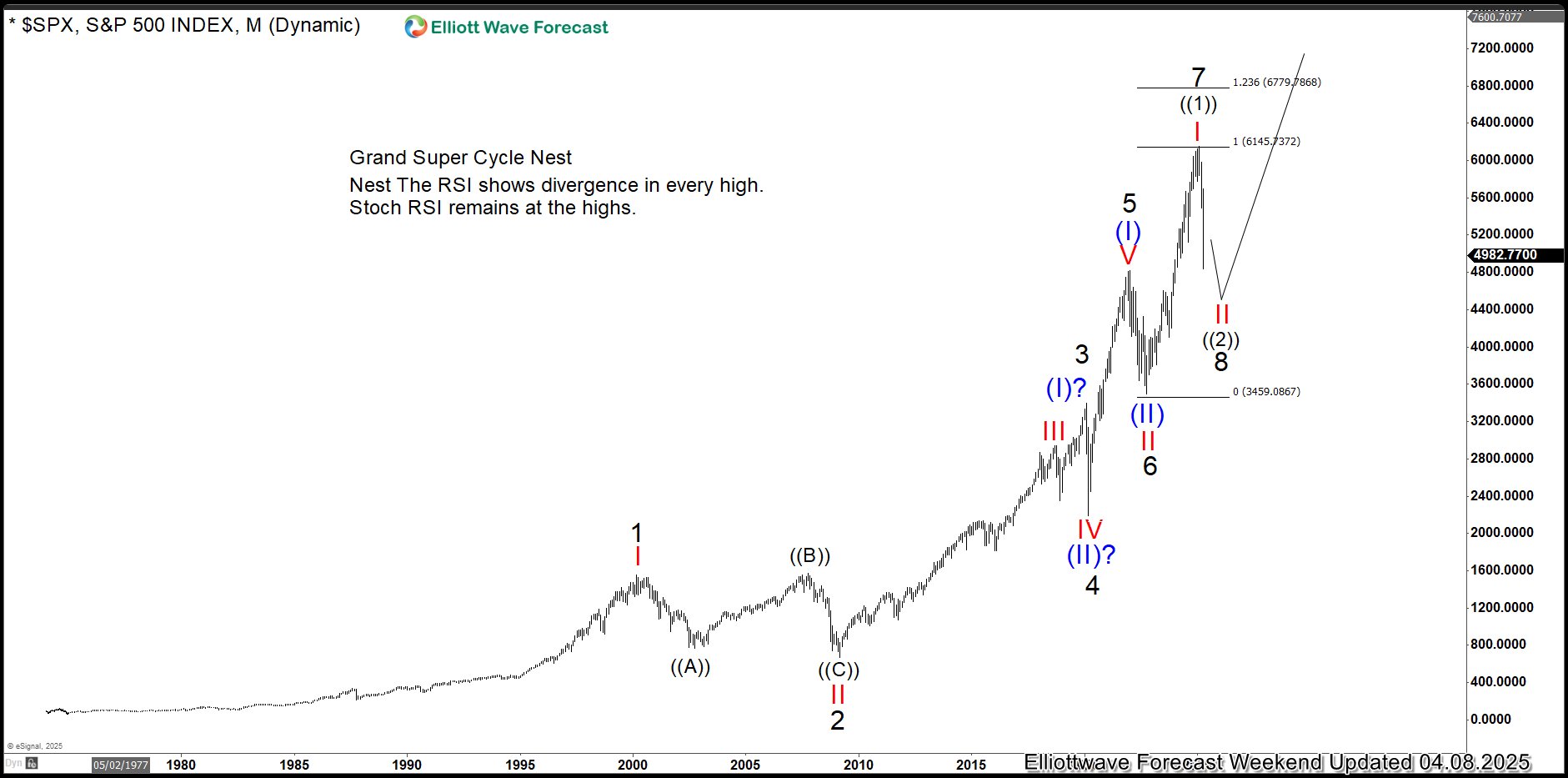
Looking at the SPX monthly Elliott Wave chart, we see a seven-swing rally unfolding from the all-time low. The first swing reached its peak in 2000, the second found its low in 2009, the third topped out in 2020, and the fourth wrapped up later that year. The fifth swing ended in 2021, the sixth in 2022, and the seventh closed in 2025, marked by Trump’s global reciprocal tariff announcement.
But here’s the catch: in Elliott Wave analysis, seven swings signal a corrective move, not a complete motive sequence. Motive waves, which drive trends, typically form in 5, 9, or 13 swings, while corrective waves appear in 3, 7, or 11 swings. A seven-swing structure suggests the index isn’t ready to form a major top. For the index to hit new highs, it would need a motive sequence—likely at least nine swings—pointing to more bullish momentum ahead.
The chart offers one way to interpret the S&P 500’s Elliott Wave structure, suggesting a nested impulse pattern. In this view, the index finished a five-wave rally by its 2021 high, which we label wave (I). A correction followed as wave (II), hitting its low in 2022. This year’s peak in 2025 marked the end of wave I within wave (III), and the current steep drop is wave II of (III). For the bullish case to hold, this pullback needs to stay above the 2022 low of 3584.1, setting the stage for more upward movement.
Here’s another way to view the S&P 500’s Elliott Wave pattern:
Alternative S&P 500 Elliott Wave Chart
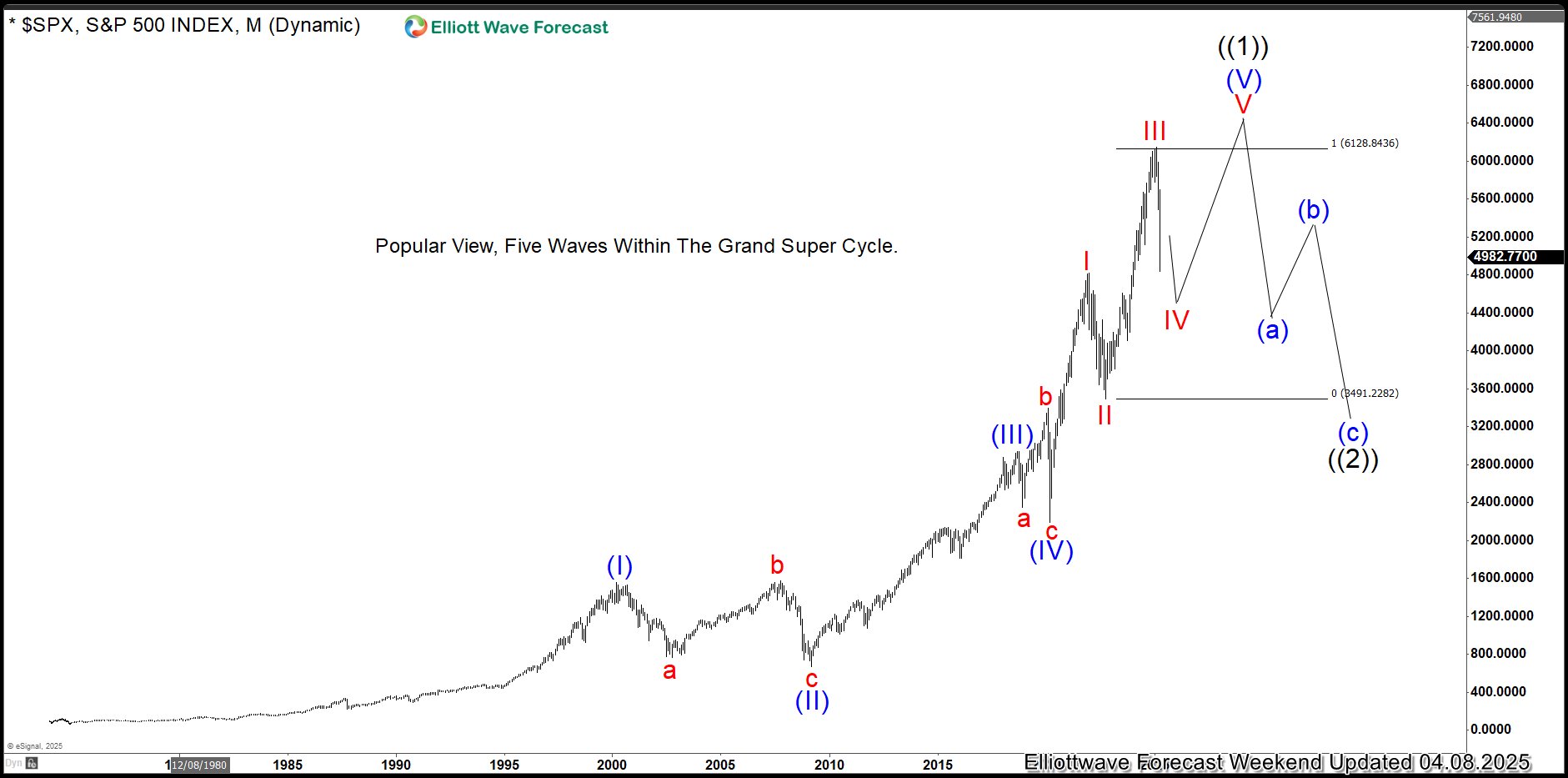
In this view, the index is wrapping up a five-wave pattern within a massive Grand Super Cycle wave ((1)). Unlike the more optimistic first chart, this setup points to an extended wave (V). The recent dip is wave IV of (V), meaning one last push higher should complete the full five-wave climb from the all-time low. After that, wave ((1)) ends, and a big correction in wave ((2)) follows. Still, this suggests the bull run isn’t over just yet.
In the charts ahead, we’ll show why this pullback doesn’t spell the end for the bull market. Some stocks simply can’t fall much further— a bigger drop would take them to zero, which doesn’t add up. That’s a clue the upward trend still has legs.
American Airlines Monthly Elliott Wave Chart
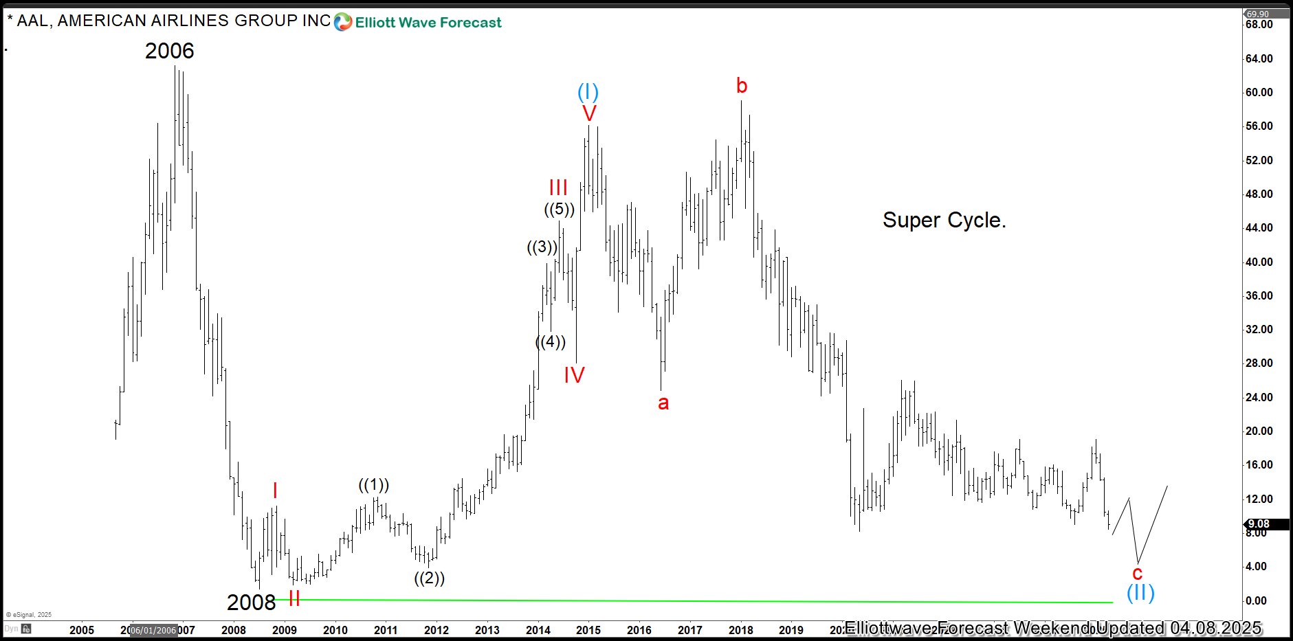
Looking at AAL’s monthly chart, the stock took a massive hit from its 2006 high of $63.27, crashing to $1.45 in 2008—a jaw-dropping 98% plunge. It clawed its way back close to that old high but couldn’t break past it. Now, at $9.07 as of April 08, 2025, it’s dropping hard again. Here’s the thing: it can’t realistically fall below $1.45 without hitting zero, which shows it’s running out of room to keep sliding. So, even if it dips more with the broader market, it’s likely to find a floor soon and head back up.
Check out the following JetBlue (JBLU) chart—it’s another case showing how stocks can run out of space to fall.
Jetblue (JBLU) Weekly Elliott Wave Chart
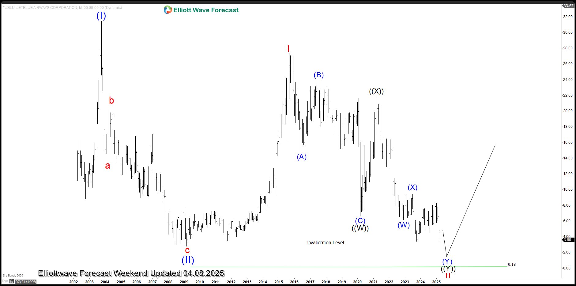
The weekly chart for JetBlue looks a lot like AAL’s story. It crashed from a 2003 peak of $31.43 down to $2.81 in 2009. It is now sliding back toward that low. If we stretch a Fibonacci extension from the 2003 high, it spits out a crazy target of -$1.23. Obviously it is not happening, since stocks can’t go negative without the company going bust. That’s a clear sign JBLU’s running out of room to keep falling.